
Created a distribution map to show the US baby names.
Shokolatte Tachikawa
DATA73000 Introduction to Data Visualization Fall 2020
Professor Michelle McSweeney
Lab7: Calculated Fields
To view my full worksheet, please click here.
I actually have a general question on this task in terms of the logic that Tableau deploys, but first please see my worksheet above.
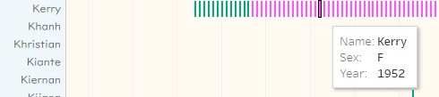
The little bars represent the dominance of the names by gender but they are both determined by the calculation that I entered per below;
[CALC: Female %] > .25 AND and,
[CALC: Female %] < .75
[CALC: Male %] > .25 AND
[CALC: Male %] < .75
*middle 1/2 here means the second and third quantile.
So when the names have both female and male within the range (between 25% and 75%), how does Tableau decides which color to show?
i.e. Kerry in 1952…
| Name | Sex | Year | Occurrences | |
| Kerry | F | 1952 | 556 | 32.2% |
| Kerry | M | 1952 | 1169 | 67.3% |
Obviously they are both in the range between 25% and 75% while Kerry has more males for the year, however, in Tableau, it picks the color for Sex: F.
This is losing my sleep. What is the logic here? Could anyone elaborate for me, please?